
Responsive Web Design Explained

Many of our clients have heard of responsive web design, but they are asking—what exactly does “responsive” mean? Responsive web design is an approach we recommend for your website users to get the best experience across a range of devices, from desktop computers to tablets and phones.
Responsive Website Examples
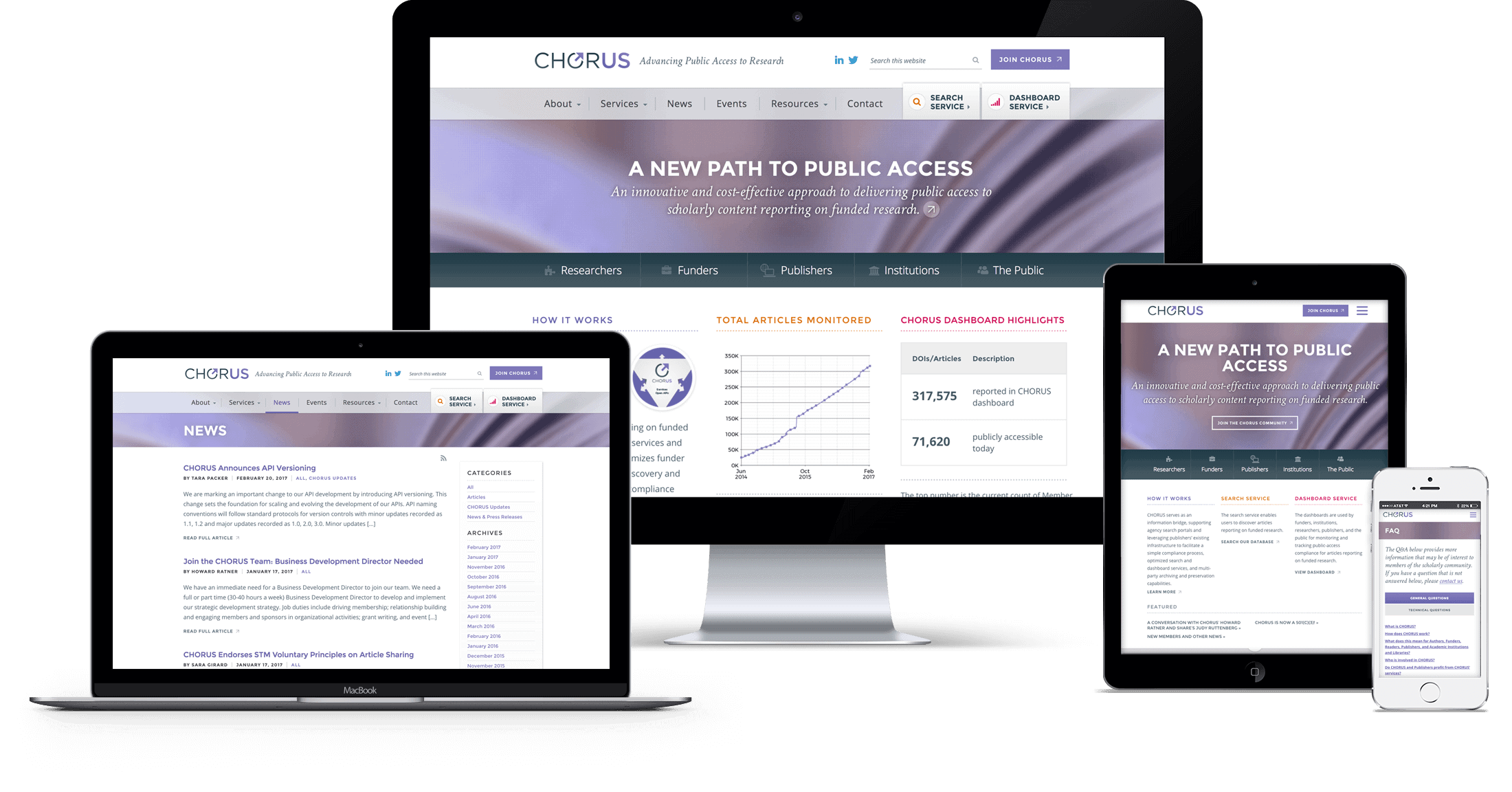
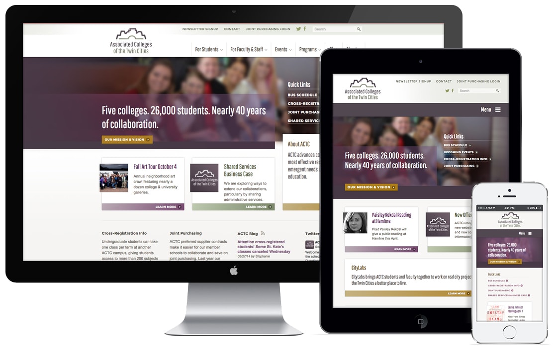
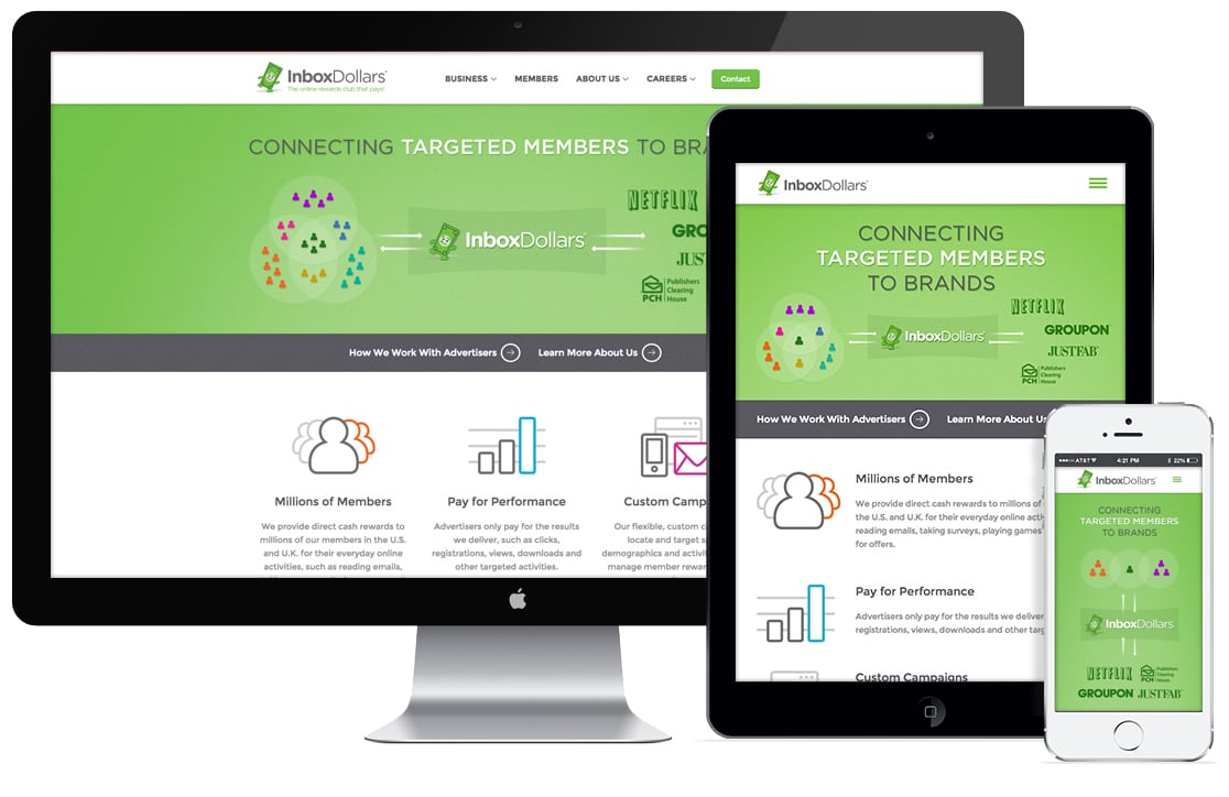
What does a responsive website look like? Below are a few examples of sites we’ve designed and developed. As the screen size gets smaller, the full navigation generally condenses to a menu icon at the top of the page. Users can simply click on the menu icon to expose the navigation. Our website is responsive, so if you try resizing your browser to a smaller width, you’ll see how the content adjusts to fit to the screen size.
CHORUS
Associated Colleges of the Twin Cities
InboxDollars Corporate
Responsive vs. Mobile Sites
A responsive website retains the same information as the full desktop version in one URL and is managed in one place. A mobile site can be a completely different experience with different information, typically planned around the specific information a user would want to gather while on their mobile devices, such as location or reservation information.